Storefront & Render
- Responsibilities
- Information Architecture, Product Discovery, Interaction Design, UI Design
Storefront was intended to be a graphical interface for shopkeepers, e-commerce managers, marketing managers and designers to add new features, modify the structure and customize the appearance of their stores without necessarily having to deal with code and more technical details. They could visually take advantage of a new platform paradigm, where stores would run extensions/apps created by the VTEX partner ecosystem. It was necessary to design the user experience for the shopkeeper profile as well for the developer profile—this was the initial focus of product creation, as it would also take advantage of the code tool behind the Storefront: Render.
Design Challenges
It was well know in the company that the project had challenges and high complexity. There were several months of discarded solutions, team reconfiguration, technological changes and many hours of meetings to try to understand the fact that we were unable to get the project into the testing and use phase. It almost became a meme in the company, but there was nothing funny about it. People really wanted to help and see its release, I was one of them. As the company's Lead Designer at that time I took the challenge.
This was definitely not an obvious project. Even when it came to discussing it, we were confused by the terms used between teams and leaders. That's when I realized that one of the main issues was defining the problem and aligning vision and also the language for the product team, as well as for VTEX as a whole.
The main project requirements were:
- Defining the problem solidly and clearly before thinking about the solution
- Align speech and vocabulary of technical terms
- Give autonomy to the entry-level user profile of the platform without killing flexibility
- Meet the technical developer profile needs from the start
- Overcoming negative expectation and regaining confidence in the face of user frustration with very well known issues with the old version in use
- Enable the creation of different versions of store settings for real-time preview and future A/B Testing feature
Design Principles
- Solid
- Global
- Reliable
- Direct
- Bold
Definition and Vocabulary
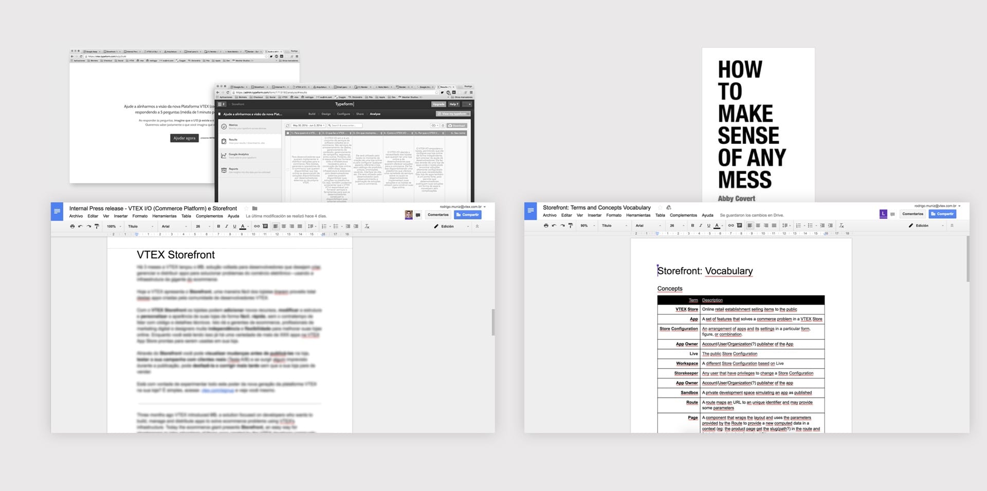
To start setting things up for success, we use the Working Backwards way of work delivering an Internal Press-Release for the whole company. It consists of writing a text in the format of a press release before starting to think about the solution, using simple language and imagining that the product was being launched that day. Working backwards helps a lot driving definitions and a solid product vision shared by the teams.
Using a 6-question framework, I sent a form link on Slack for direct stakeholders and team members and compiled the responses into a draft press-release. Then the Storefront team revised and iterated on the text, so we had an overview of the shared vision of the product we were creating. Furthermore, in order to speak the same language and hammer out concepts that were still open, we created a collaborative vocabulary based on the book How to make sense of any mess.
- Who was the product created for and who created it?
- What does the product do and how is it called?
- Where will it be used and where can someone find it?
- When can it be used and when will it be available?
- Why is the product notable and why is it relevant to your audience?
- How does the product meet a need and how does it solve a problem?
User journey mapping
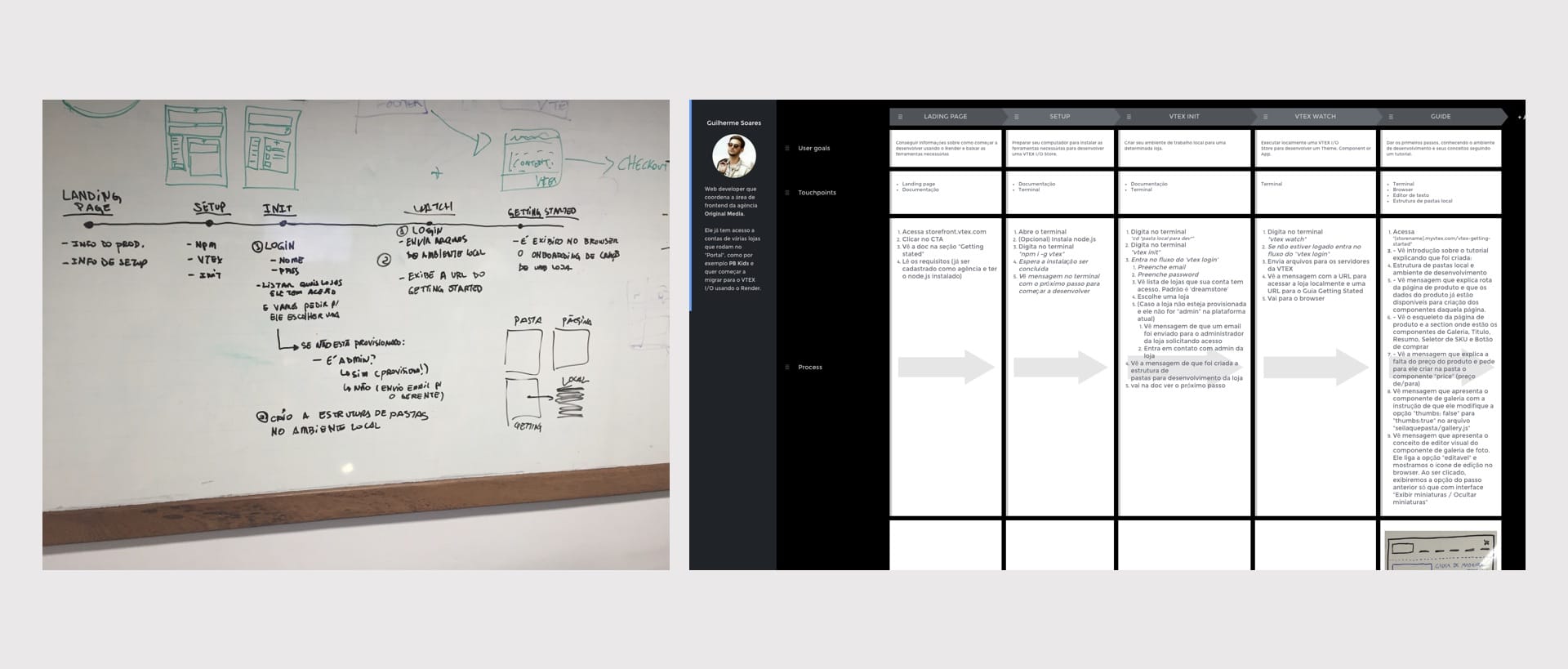
Mapping the user's journey was essential for us to plan what kind of interaction and solutions we would deliver at each point of contact between the product and the user. At this point, we decided to initially focus on the journey of the technical profile: the Developer, as they would naturally have more points of contact as the advanced user profile.
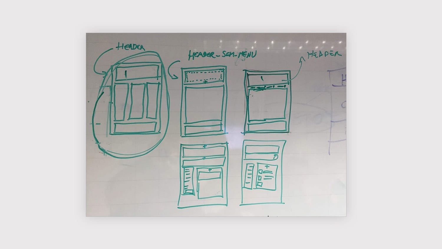
Prototypes
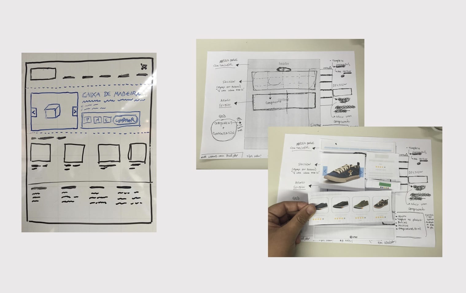
With the profile defined, we set out to draft and explore concepts of the features that the product would offer. Hours of whiteboard sketches, paper, pen and scissors with grids, placeholds and paper components.
Template Store and Styleguide
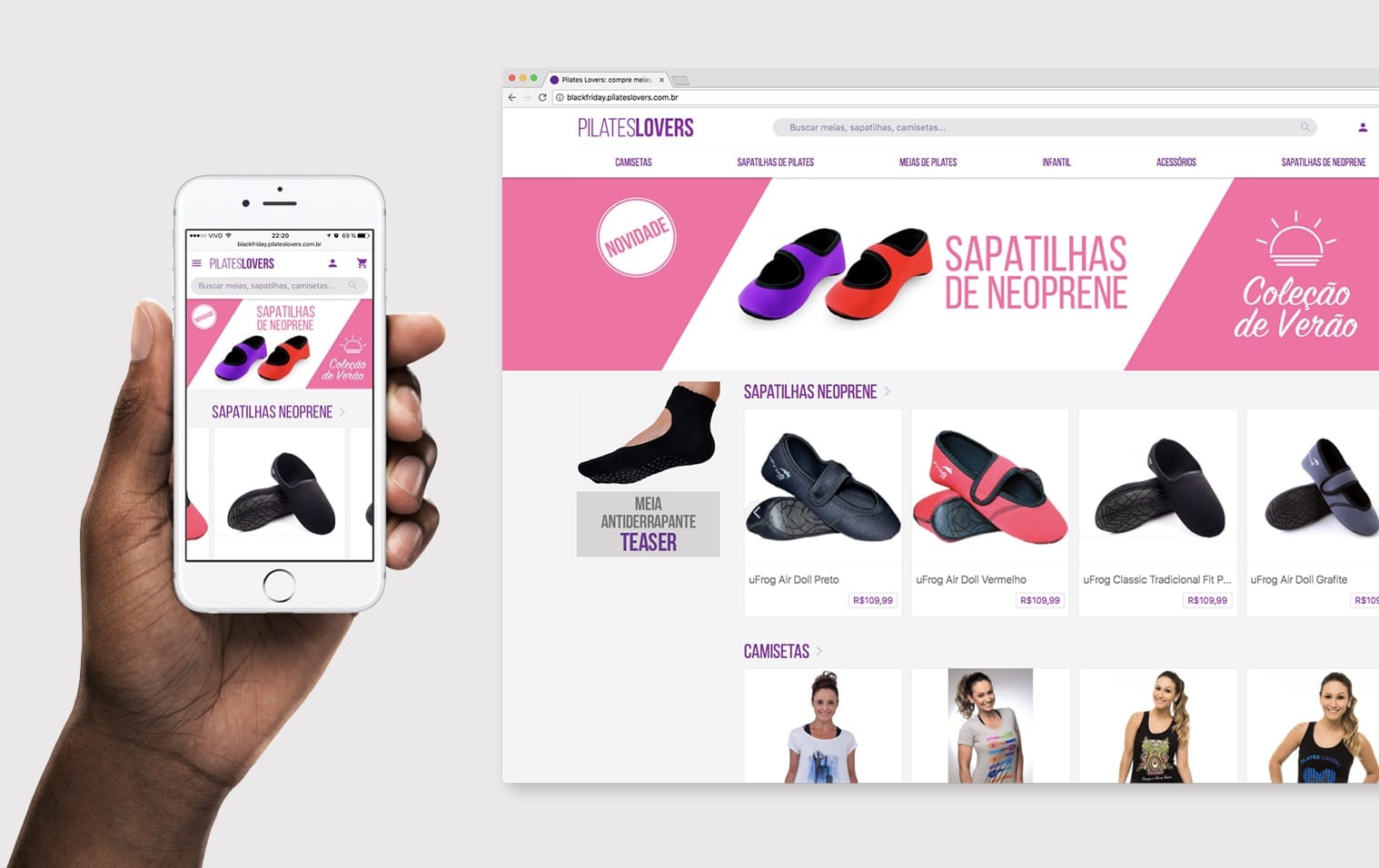
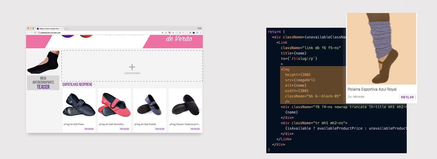
After some discussions we came to the conclusion that the only way to make the best store and app development tool for the platform would be to put ourself in the shoes of a VTEX developer, having a real store to maintain. That's when we asked for the help of one of our colleagues, Afonso, who already owned a VTEX store and kindly agreed to be our "laboratory" store. We designed a new version of their Pilates Lovers store from scratch using the new IO structure with Render and Storefront.
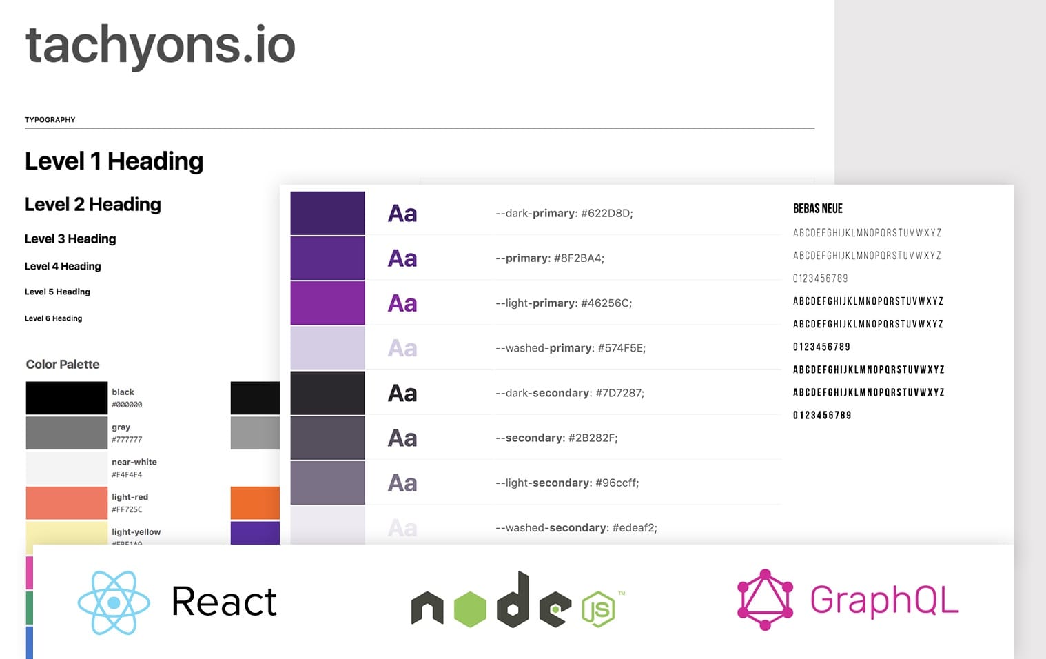
While talking to VTEX developers from agencies from the whole country, we technically refined the store based on the work of those partner developer (who usually worked within a team), adding concepts live Styleguide to define store theme variables such as colors and typography. This was based on the Tachyons Atomic CSS framework—ideal for the highly scalable React technology used in the Frontend and Backend of the platform new version. The store also had a new responsive and flexible grid structure to receive the most diverse types of e-commerce components.
On average, every 3 weeks we personally did some hands on with guest developers from the VTEX ecosystem, collecting feedback and finding blind spots.
Placeholder and Components
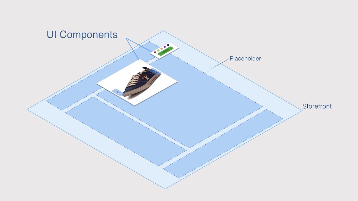
The next big step was to explore what were considered the two basic concepts of the system: Placeholder and Components. The first was a developer-defined area of the store for managers and storekeepers to manipulate its settings or add miscellaneous components like banners, product shelves, and menus. This would allow developers to create and offer apps with customizable components for all platform customers through the Extension Store.
Render in action
Next steps
Due to the proximity of the annual VTEX launches event for partners at the time, the project was paused so that the team could focus energy on creating the new graphical interface for IO and Extension Store, a project in which I also participated as a designer. The next steps for Storefront would be:
- Concept and UI for component settings editor
- Visual Integration with Extension Store
- Drafts and Versioning of store settings
- Native support for A/B Testing
Credits and Team
- Anderson M., Backend Developer
- Bruno A., Backend Developer
- Guilherme R., Frontend Developer
- Thor A., Frontend Developer