VTEX IO Navigation
- Responsibilities
- Information Architecture, Product Design, Interaction Design, UI Design
Called VTEX IO, the new version of the e-commerce platform in 2017 was getting a complete redesign and a new paradigm, where online stores would run extensions/apps created by the ecosystem of VTEX partners. This aroused a great concern with complexity, which already reached a good part of the old version of the product. One of those problems was in the way of navigating through the current and future modules.
The old navigation
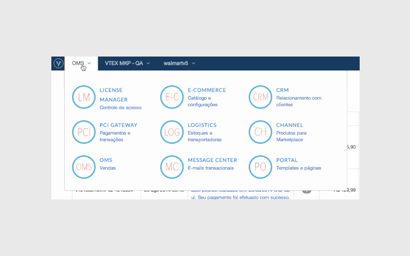
Despite looking quite simple and flexible, the old version of the navigation followed a logic based on the names used internally by VTEX to name its modules. The mental model was wrong, which meant that new users had to learn what each module did before being able to use them—this greatly restricted the platform's capability of being explorable and created a user dependency on documentation from the get-go.
Another problem: there was no sub-navigation solution, a quick way to go directly to a subsection of each module which we knew, looking at data, the users were already doing using bookmarks. In practice, the navigation was not very straightforward nor really flexible as it looked.
Design Challenges
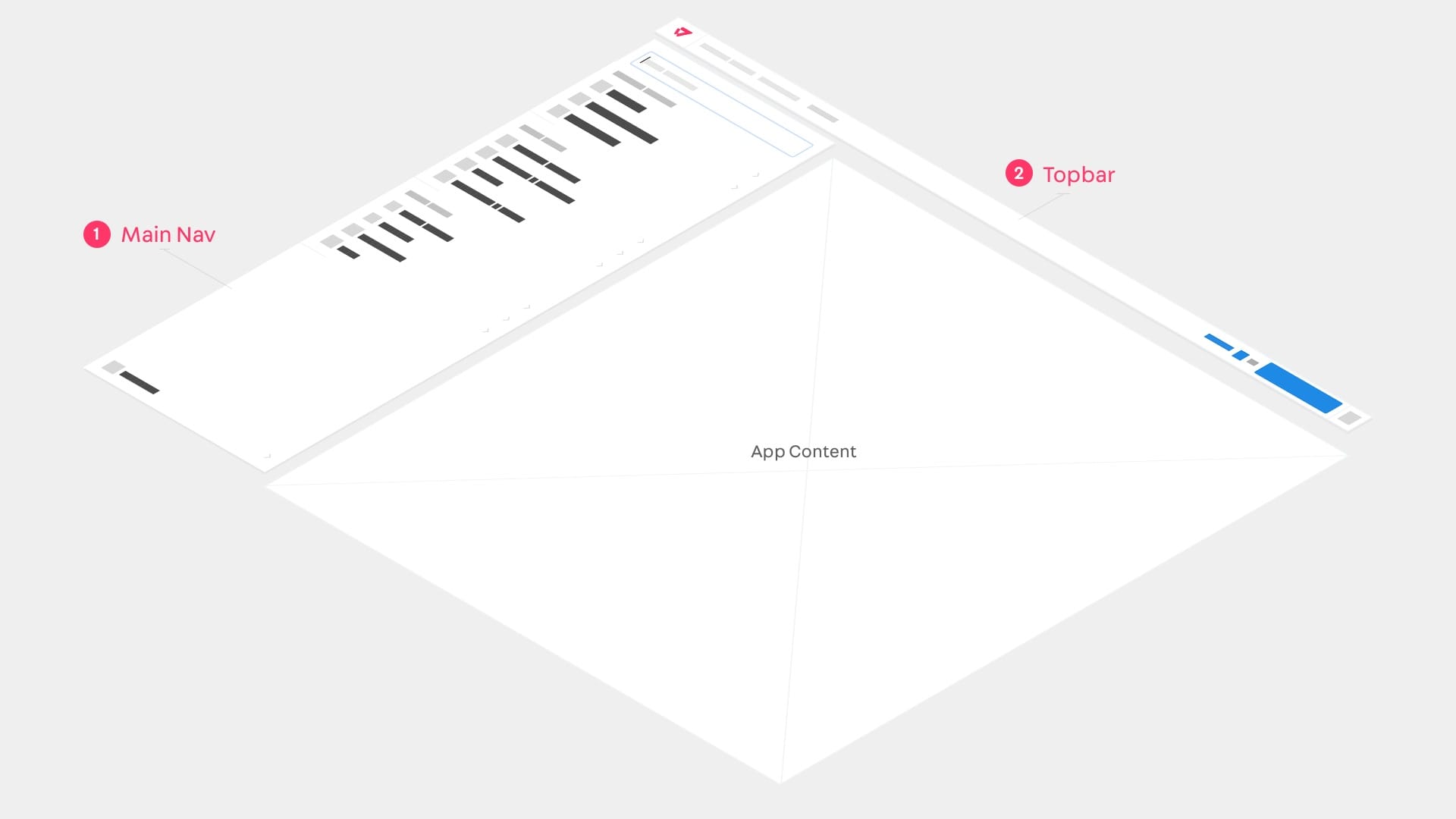
In addition to replacing the old one, this new navigation also needed to:
- Be cross-device and mobile-first
- Serve as one of the visual foundations for the new Design System of the company's new visual language
- Have an structure capable of organizing and grouping links for new and old modules, due to its use in the migration phase of platform different versions
- Have the flexibility to receive links to apps created by third parties, partners that in the future would have the possibility of inserting new modules in their online stores management system
- Be released alongside a new native VTEX product called Extension Store were partners would publish their own modules
Design Principles
- Consistent
- Direct
- Extensible
- Useful
Information Architecture
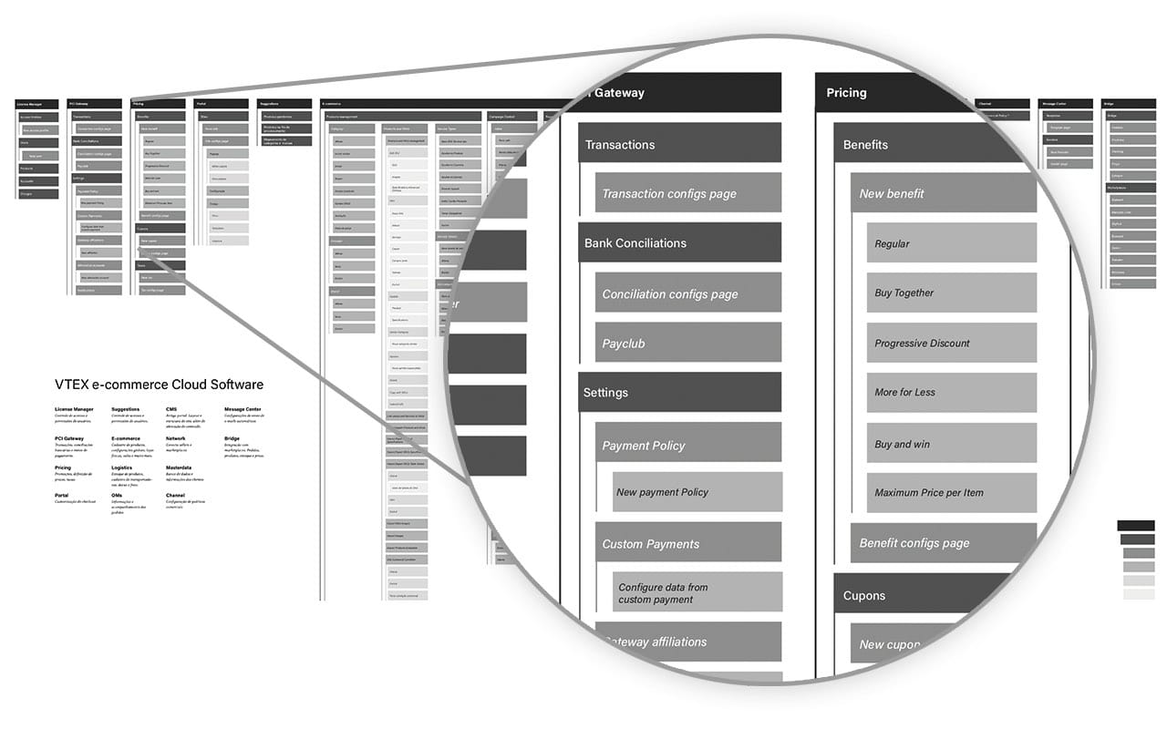
Initially when discussing the solution, we quickly came to the conclusion that the organization and grouping of information would be the project biggest challenge.
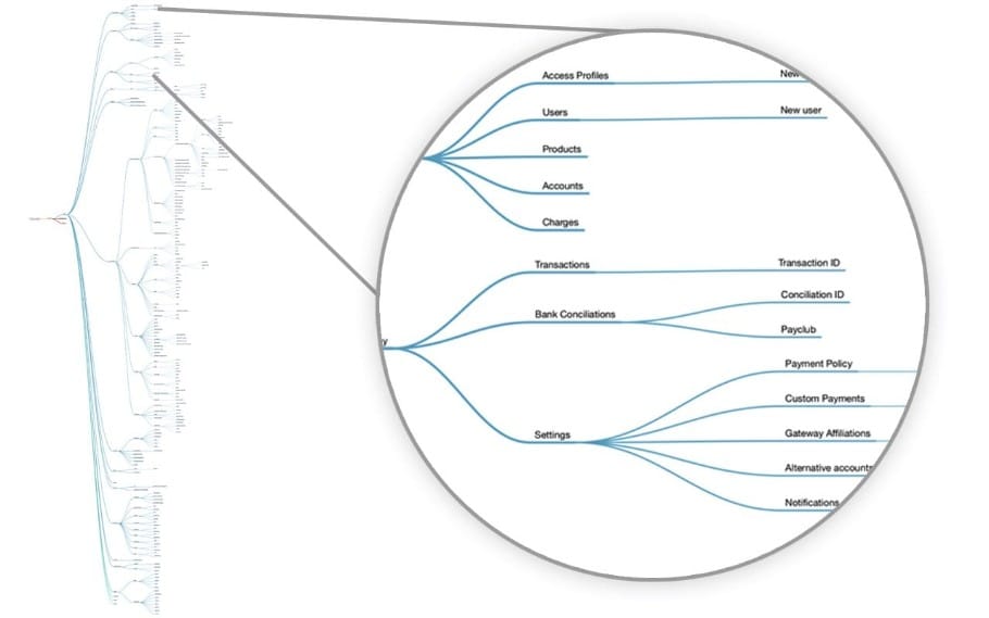
Based on the incredible work of researching all the platform links done a few weeks earlier by Bernardo Lemgruber, I started a benchmark study and facilitated some quick workshops with members of the company technical support team. The objective was to arrive at a logic of information groups that was easily understood in the ecommerce context. It was at this stage that we decided to take into account not only VTEX but the general e-commerce context, changing the use of names such as OMS and PCI Gateway for a more common vocabulary such as Orders, Payments and Prices.
Benchmark
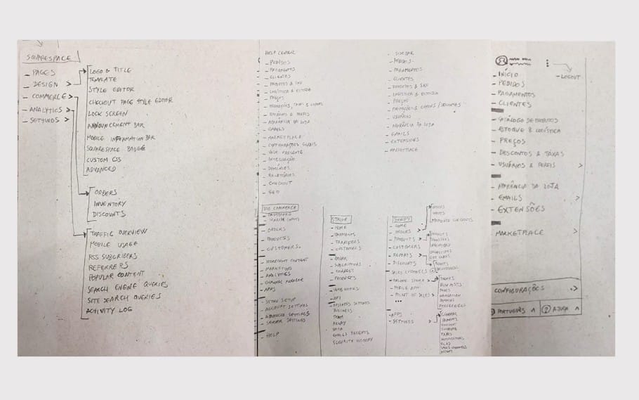
In this step, we created a moodboard so we could collect benchmarks and we also worked with a spreadsheet to explore different types of grouping of all the platform links.
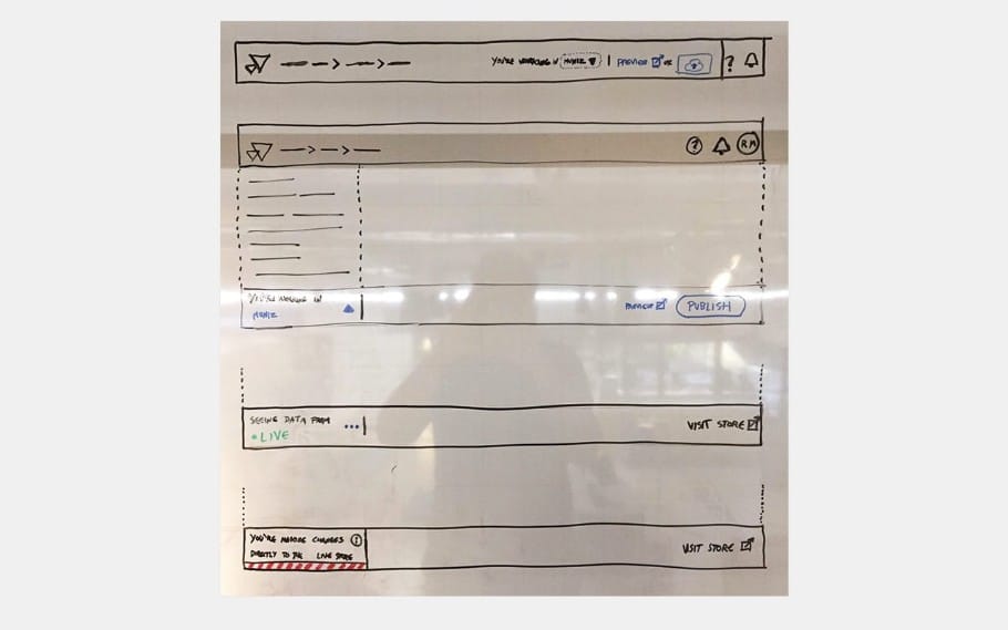
The work I had done the previous year, categorizing articles in the platform's Help Center knowledge base was also taken into account. However, in addition to internal references, we carried out a research for similar solutions in navigation on other e-commerce platforms and also in Content Management Systems in general, analyzing not only their structure but also their behavior. We then started prototyping on paper and whiteboard, followed by high fidelity prototypes.
Prototypes
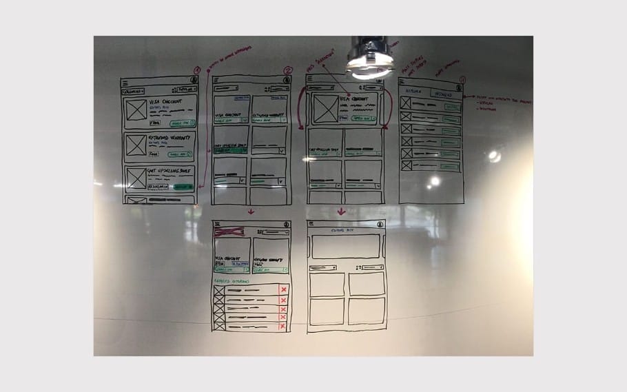
As the navigation would be launched alongside a general redesign of the platform with the Extension Store module—another designer on the team, Luiza Breier, and I worked on solutions for visual design and general structure of the store, taking into account that it would be used as the foundation for the new Styleguide and would also be the initial use case for the new navigation. We dedicated a few days to work on a wide range of layouts and flows variants to collect feedback from the design team and some stakeholders.
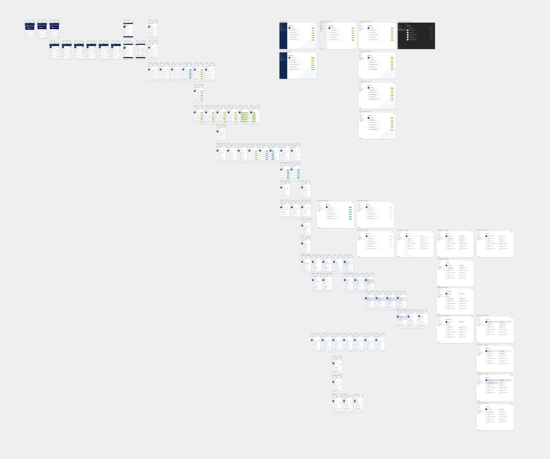
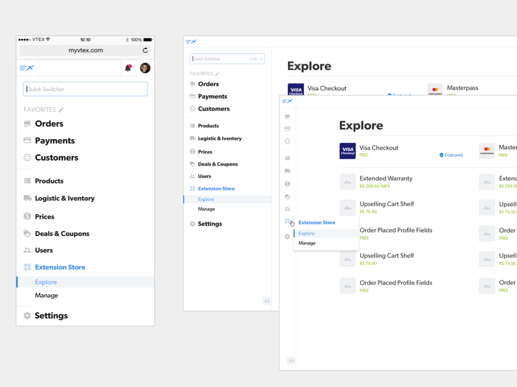
The following is an overview of one of the Sketch files for the Extension Store and navigation UI variants generation phase:
Initially the navigation structure was designed to have 3 major variants:
- Mobile
- Desktop/Tablet
- Desktop/Tablet (Minimized, which was discarted)
Quick Switcher
In the video, when searching for the old "OMS" sales management module, the user would see the sales module in the new version of the platform as the result.
The Quick Switcher was a solution to several issues in the new version. Not only would it meet the "Useful" and "Direct" principles for super-fast navigation between modules, but it would also help the current platform user find the equivalent module of the old version in the new one, during the migration period.
The old and the new
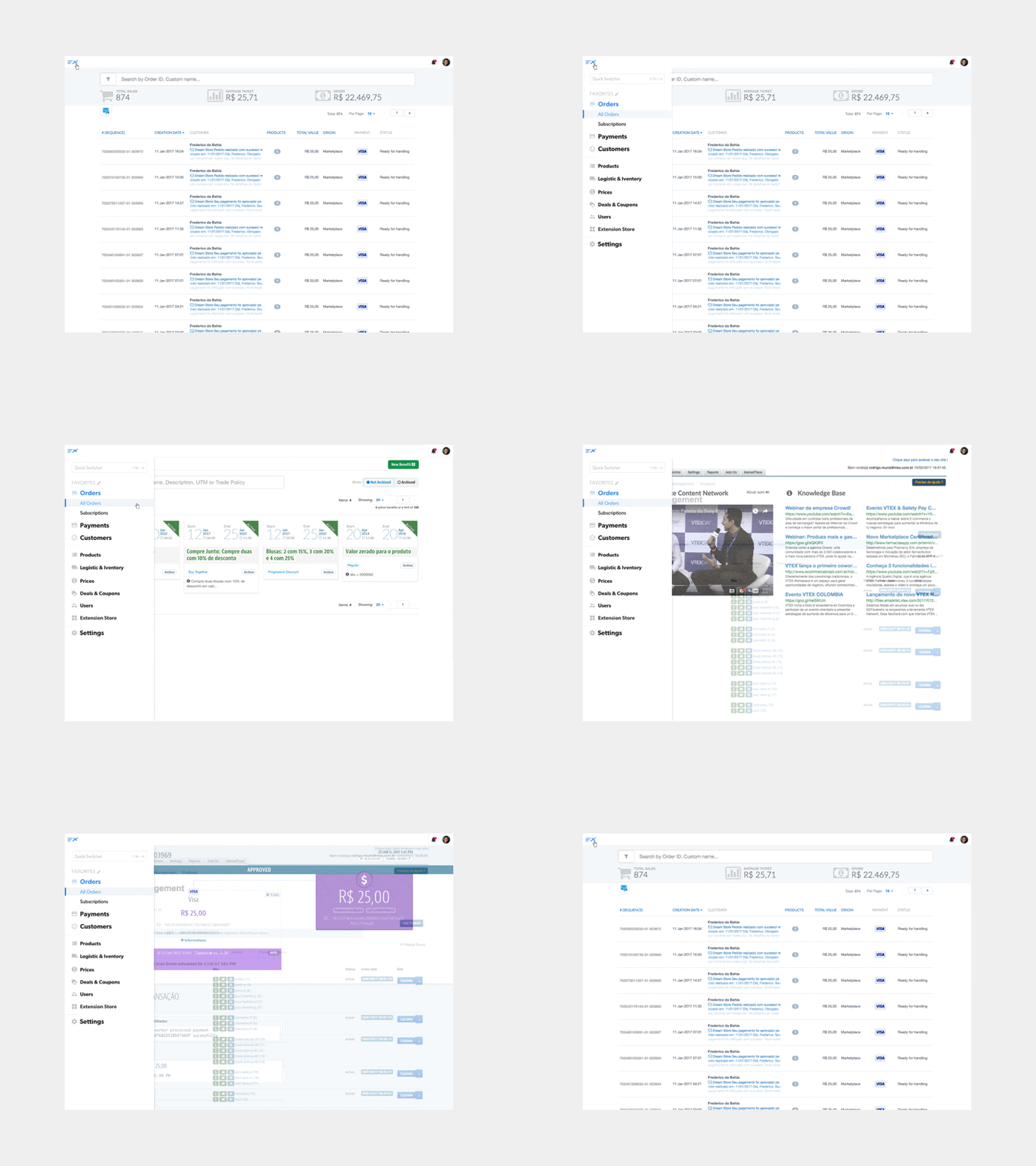
As the navigation would also need to be present in the old version of the modules, we created the prototype of a version that would be a sidebar that appeared from left to right, responding to the user's click on the menu icon at the top of the old manager system. On mobile, the navigation would appear in full screen.
Public Beta

The Beta had two phases, a close beta on the week of the company's annual event, VTEX Day 2017, were the Extension Store was announced. At that time we were able to conduct some guerrilla usability testing with partners and members of the VTEX financial team. The biggest issues encountered were related to performance and some bugs that would be fixed quickly before the second phase: the public beta launch, when shopkeepers began to use and evaluate the beta version of the solution giving feedback using a form link which later was used to feed the team backlog.
Credits and Team
- Anderson M., Backend Developer
- Guilherme R., Frontend Developer
- Luiza B., Jr. Designer
- Thor A., Frontend Developer
